Walk into any successful business, and you will notice something before a single word is spoken. The walls have a certain warmth. The logo carries a quiet confidence. The product packaging seems to reach for your attention without shouting. This is not accident. This is color speaking a language older than words.
Color is the silent salesman. It works in the background, shaping emotions, influencing decisions, and building trust before a handshake ever occurs. Businesses that understand this wield a powerful tool. Those that ignore it leave money on the table.
First Impressions Happen in Milliseconds
Research in consumer psychology has revealed a striking truth: people form a first impression of a product or brand within 90 seconds or less. Up to 90 percent of that assessment is based on color alone. Before a customer reads a single word of your mission statement, before they compare your prices or check your reviews, color has already whispered something into their ear.
A bank that uses soft blue and gray suggests stability and calm. A children's toy company splashed in bright yellow and orange screams energy and fun. A luxury watch brand wrapped in deep black and gold whispers exclusivity and elegance. None of these messages require explanation. They are felt instantly.
Color Creates Emotional Shortcuts
Human beings are emotional creatures pretending to be logical ones. Every purchase—whether a cup of coffee or a corporate contract—carries feeling. Color taps directly into that feeling without passing through the gate of rational thought.
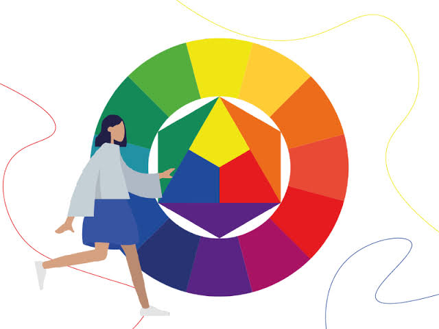
Consider the following associations, carefully cultivated by decades of cultural and commercial conditioning:
- Blue – Trust, security, professionalism, calm. Used by banks, hospitals, and social media giants.
- Red – Urgency, excitement, passion, hunger. Used by clearance sales, fast food chains, and entertainment brands.
- Green – Growth, health, nature, wealth. Used by organic products, financial services, and environmental campaigns.
- Yellow – Optimism, warmth, attention. Used by window displays and warning signs alike.
- Black – Sophistication, power, mystery. Used by luxury goods and high-end technology.
- Purple – Creativity, wisdom, royalty. Used by beauty brands and imaginative services.
These associations are not universal across every culture, but within a given market, they are remarkably consistent. A business that chooses colors randomly is like a speaker who mumbles into a microphone—something is being said, but nobody is sure what.
Color Increases Brand Recognition
Beyond emotion, color serves a practical purpose: memory. A distinctive color palette can increase brand recognition by up to 80 percent. Think of a famous soft drink company and its signature red. Think of a shipping company and its brown trucks. Think of a coffee chain and its deep green siren. You do not need to see the name. The color alone tells you everything.
This is not magic. It is repetition married to association. When a business uses the same colors consistently across its logo, website, packaging, and physical space, it builds a visual shortcut in the customer's mind. Over time, that shortcut becomes almost impossible to break.
The Cost of Getting It Wrong
Color can also work against a business. A hospital painted in harsh neon colors would feel aggressive, not calming. A law firm using bright pink might be memorable, but for the wrong reasons—clients would question its seriousness. A budget brand using deep purple and gold would confuse shoppers, because luxury colors raise expectations that low prices cannot meet.
One famous case involved a technology company that changed its logo from blue to a more vibrant green. Sales dropped for six months. Customers, without knowing why, reported feeling that the brand seemed "less reliable." The company quietly returned to blue. Color had spoken, and the market had listened.
A Practical Conclusion for Businesses
None of this means that a small business needs an expensive designer or a complex color study. But it does mean that color deserves thought. Ask yourself: What feeling do I want my customer to have? What action do I want them to take?
A restaurant wanting fast turnover might choose red and yellow—colors that create slight urgency and stimulate appetite. A spa wanting long, relaxed visits might choose soft green and beige—colors that lower heart rate and encourage stillness. A website wanting visitors to trust and stay might choose blue and white—colors that whisper safety and cleanliness.
In the end, color is not decoration. It is communication. And in business, where attention is scarce and competition is fierce, every message matters. The question is not whether your business uses color. Every business does. The question is whether your colors are working for you—or quietly working against you.
The silent salesman is always in the room. It pays to know what he is saying.
Comments (0)
Comments are published after admin approval.
No approved comments yet. Be the first to comment.